
Introduction:
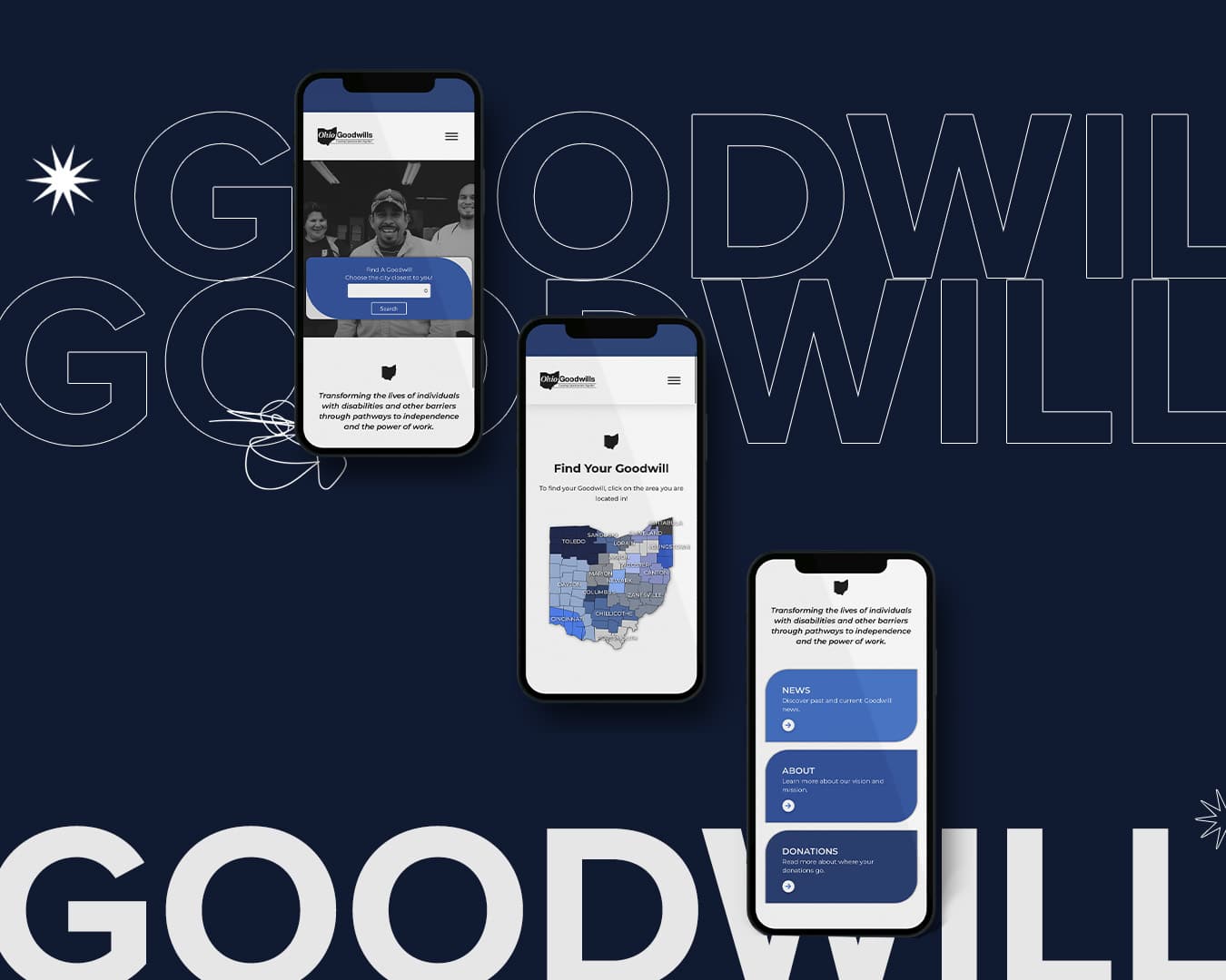
Screen responsiveness is one of the most important features of good website design. Does your website look great on your desktop, but when you pull it up on your phone images float off the screen and words are jumbled together? This is a sign that your designer didn’t account for different size screens.
According to multiple studies, users visit websites on their phones a higher percentage of the time than they do on their computers. We live in a fast-paced society where it is common for people to be head down, buried in their phones.
Illustration:
Think about it. It makes sense. If you are out and about at the grocery store and you think to yourself, “I would love to grab some ice cream after this but I’m not sure what’s open,” your first instinct is probably to pull out your phone and search “ice cream near me.” Logistically, you wouldn’t grab your groceries, go home, sit down at your laptop and search “ice cream near me” only to have to go back out again afterwards. At that point, you’re home. You might as well pull some Ben & Jerry’s out of the fridge and stay home, right?
After you’ve searched the stores that are open, you will click on the top searches to see the flavors available at each location and scope out the quality of the establishment. The quality of your website becomes a customer’s first impression, which we talked about in this article.
Conclusion:
Your potential customers will visit your website on multiple different devices. There is no getting around this phenomena and it is important for you to put your best foot forward in all arenas of the web. We would love to work with you and set you up for success! Contact us using any of the methods on our contact page.
Supporting Articles:
Mobile vs. Desktop Usage by Robin Layton
Internet Traffic from Mobile Devices by Josh Howarth